
Insight Article
Visualizing the Gap: Strategic UI & Performance Optimization for Johnny Grow
Featured
#Visual Strategy
+4 more
Share this article
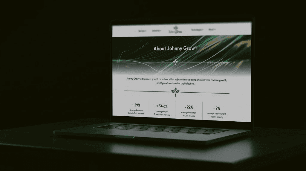
How I transformed a complex data comparison into a high-impact visual strategy for Johnny Grow. From hard-edge graphic design to website asset optimization, this is how I visualized the gap between market Laggards and Best-in-Class companies.
Clear positioning matters a lot in growth consulting. For Johnny Grow, the goal was never to say they drive impact. The goal was to show it in a way that felt undeniable.
This case study breaks down how data-led strategy, sharp visual thinking, and smart technical execution came together to turn Johnny Grow’s positioning into a digital experience that is instantly clear and impossible to misunderstand.
The Client Challenge
The business growth space is noisy. Everyone promises things like “scale faster,” “grow smarter,” or “unlock potential.” Johnny Grow wanted nothing to do with vague claims.
The challenge had two clear parts:
First, how do you define “best in class” in a way that feels objective, measurable, and defensible?
Second, how do you visually show the difference between struggling businesses and true market leaders without leaning on interpretation or marketing fluff?
The client did not want a soft gradient or feel-good spectrum. They wanted a system that ranks performance clearly and honestly.
Project Goals
The goals were straightforward and uncompromising:
Build a performance framework rooted in real business metrics, not opinions.
Make it instantly obvious where a company stands today and what level of performance is required to move up.
Design a visual system that loads fast, reads at a glance, and integrates cleanly into the website without losing its punch.
Strategy and Approach
Data-First Positioning
Instead of relying on abstract messaging, the entire strategy revolved around comparative data. This was not about persuading through clever copy. It was about creating confidence through structure.
The answer was a three-tier performance framework. Each tier represented a fixed ranking position, not a flexible range that could be interpreted in multiple ways.
Tier Framework Design
The framework was intentionally strict and direct, matching Johnny Grow’s belief in clarity over comfort:
Laggards (Lower 35%)
Organizations with little momentum, marked by slow revenue growth, weak EBITDA, limited valuation growth, and low customer advocacy.Medians (Middle 50%)
Businesses that are doing “fine,” but remain stuck in average outcomes with no real structural edge.Best in Class (Top 15%)
Companies showing exceptional performance across revenue, profitability, valuation, operational vitality, and Net Promoter Score.
This was not framed as a motivational journey. It was a ranking. Moving between tiers requires real change, not optimism or clever storytelling.
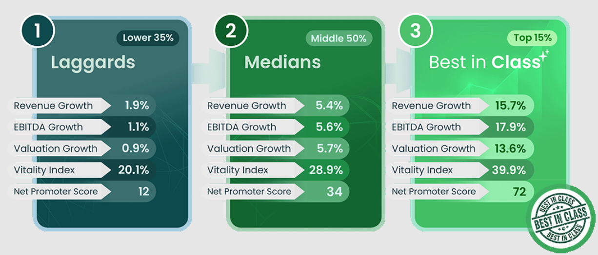
The goal was never to create a smooth spectrum. It was to create a clear ranking.
Each tier represents a fixed position, making one thing obvious right away. Moving up requires deliberate change, not small tweaks or hopeful thinking.
UI and Website Optimization
Building the framework was only half the job. Its real power came down to how it showed up on the screen and how fast it performed.
Asset Optimization
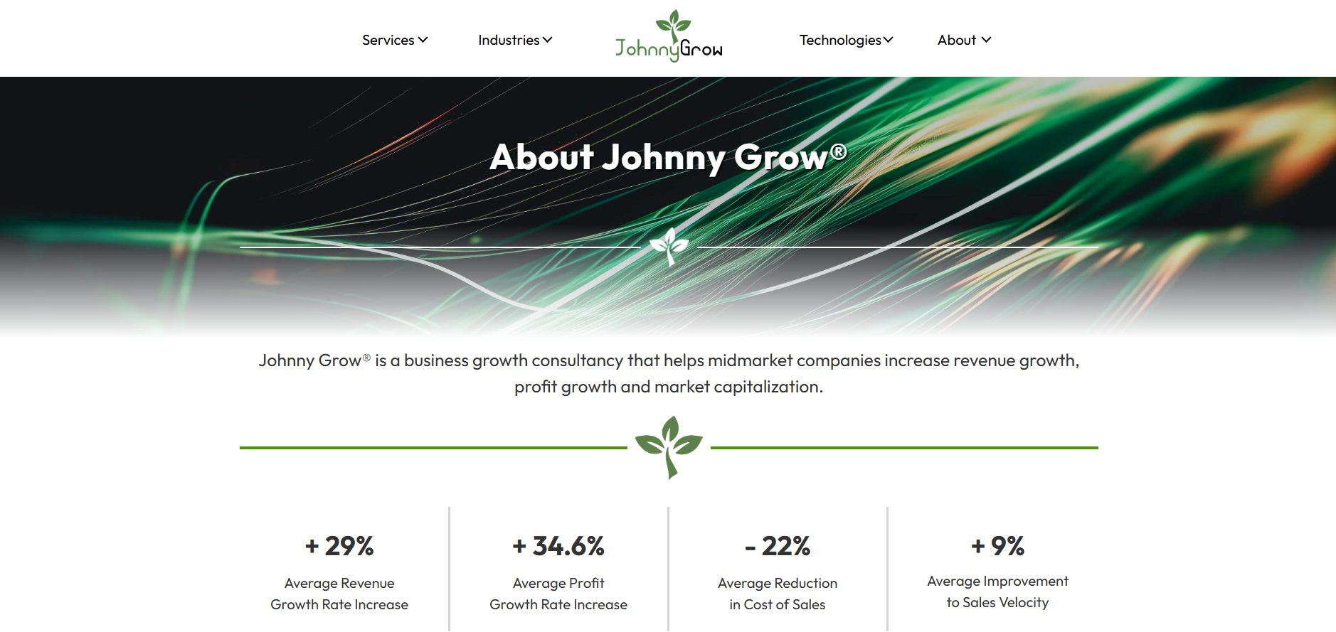
High-fidelity visuals were carefully engineered to keep crisp edges and strong contrast while drastically reducing file size.
Design assets exported from Photoshop were converted into optimized PNGs, ensuring fast load times without losing clarity or impact.
Visual Hierarchy and Focus
The surrounding UI was intentionally stripped back to remove noise and distractions.
Whitespace was used with purpose, guiding the eye directly toward the “Best in Class” column.
Extra emphasis was placed on EBITDA and Valuation, reinforcing the metrics that matter most to serious decision-makers.
The end result was a layout that communicates hierarchy instantly and still holds up when examined closely.
Outcome
The gap between performance tiers is instantly visible. No explanation needed.
Users can quickly spot where they stand today and clearly understand what “best in class” actually looks like in practice.
The design reinforces Johnny Grow’s positioning as a no-nonsense, results-focused growth consultancy that values truth over theatrics.
This was not about visual flair for its own sake. It was a disciplined translation of strategy into a visual and technical system built for clarity, speed, and credibility.
Conclusion
This project shows what happens when data, design, and performance engineering work in sync.
The final system reflects the data it represents. Structured, direct, and unapologetically comparative. It makes one thing clear.
Staying average has a cost, and it is impossible to ignore.
👉 Explore Johnny Grow here: A Business Growth Consultant to Help You Scale Revenue